A brief look at how choosing light or dark colours on your website can effect visitor behaviour.
Much as we would love every visitors to read and view our websites with care and consideration most will make their minds up with in seconds of landing on your site pages. As a result getting the right design is key to appealing to your customers, preventing high bounce rates and supporting sales and enquiries.
First Impressions
Customers will form an impression of your website in the first 0.05 seconds. Clearly this is too little time for them to have read any content so this impression is all about the design.
A huge 94% of visitors will continue or reject a website on design alone and while having an appealing design is vital it also needs to show the site can be trusted.
If a customer has dismissed your website because of its design they are not going to come back!
So consider is your current website design helping your company online?

Light or Dark – Which is Best?
While lots of people talk about the phycology of colour choices most companies already have chosen their company colours and want to keep these when having their website designed.
With this in mind it can be more useful to look at the effect of light or dark colour choices and how customers relate to these.
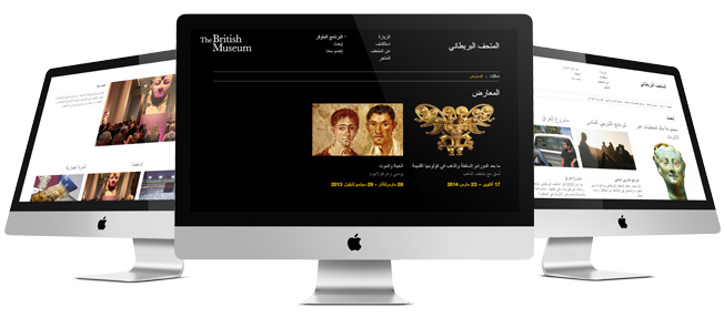
The following data looks at taking the same improved website design and creating a dark colour version and a light colour version. The results show how much each version was effected by either selecting dark or light colours.
- Traffic Increase – Dark colours increased by 2% while Light colours by 1.3%
- Bounce Rate – Dark colours choice has a bounce rate of 44.4%, while light colour choices has a bounce rate of 46.2%
- Avg Time on site – Dark colours had an average visit time of 3.18 seconds, while light colours had an average visit time of 3.15 seconds
Conclusion
As you can see there isn’t a huge difference, but darker colours currently appear to have a slight edge.
The take away is that using darker colours can grab attention while light colour are easier for customers to ignore. Using this knowledge can help create a balanced design where key messages and features use bold darker colours, but are set off using lighter colours to create contrast and visual interest.
Find out more about ExtraDigital website design solutions:

