Responsive Progressive enhancement applies this to responsive web development and allows for the efficient development of websites in an era of multiple device sizes and characteristics.
Progressive Enhancement
Progressive Enhancement is the principle of starting with a rock-solid foundation and then adding enhancements to it where you know certain visiting user-agents can handle the improved experience.
Progressive enhancement is way of catering for different users, or more specifically users on different types of browser. Catering for people using old laptops with archaic web browsers has been a nightmare for many years for web developers.
In the UK the life of website developers involved with government or education websites has been particularly difficult due to high percentage of old browsers in use within these organisations.
There were two approaches to solving the different browser issues:
- Image or design led, graceful degradation.
- Content led progressive enhancement.
One way of describing the difference is Graceful degradation goes from complexity to simplicity whereas progressive enhancement goes from simplicity to complexity.
Image driven website development.
This starts with a pretty picture (an artist’s view) or an engaging visual interactive experience. And then adds content to fit. The code is written to degrade in older browsers to something that is ok to look at.
When new technologies arrive that enable new way of showing creating websites, the technology leads the way with content being fitted in around, and alternatives created for those unable to use these technologies.
Content led progressive enhancement.
This starts with the message or the content. This is produced in accessible HTML (web language) – an information rich way of delivering the content. It is then made to look pretty with CSS (style sheets). The user experience in enhanced further with CSS3 or JQuery. So technologies are applied as layers like rings of an onion.
One of the best illustrations of this concept we have seen is by Aaron Gustafson in his book ‘Adaptive Web Design’ who uses the M&M peanut example. The image below and the initial ideas below are taken from chapter 1 of Aaron’s book (http://adaptivewebdesign.info/1st-edition/chapter-1/) extended to responsive websites.
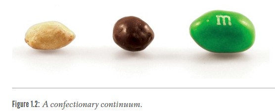
The peanut is the rich source of protein and fat – a great food for all to enjoy. This is the content of the website marked up in HTML code.
Cover it in chocolate and you get a treat that many say tastes better. This is the CSS that makes the content look better.
Coat it in coloured candy shell and you get the attractive sweet that is fun to share and eat. This is the CCS3 or JQuery that makes the user experience more enjoyable.
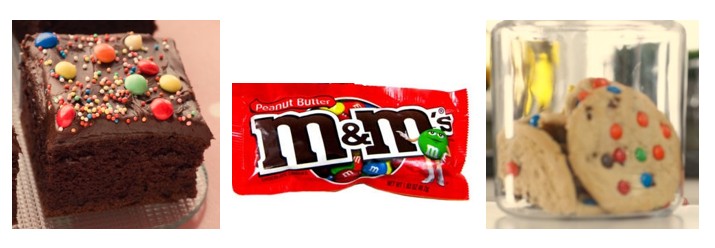
The M&M can then be packaged for sale, make into cakes or cookies or shown in a jar depending on location. This is the media query, showing the web content in a different manner depending on the device.
Responsive Progressive Enhancement for marketing
Responsive progressive enhancement provides the most effective marketing websites as it starts with the core content, then makes this look good and then adds on user interaction.
The content is the core material – for the search engines and to provide the information for the user. The styling makes it pleasant to look at or attracts the user to digest the content. And the attention to usability and user interaction makes the experience easier, more interesting and memorable and will encourage recommendation and repeat visits.
Good design principles help provide the best marketing.
