Having worked in the web design business for over a decade, we have seen many fads come, with trends changing more times than David Beckhams haircut. Whilst some of these trends have been purely based on opinion, guesswork can only take you half the way – Opinions don’t make money! The best trends we have seen are based on good old data.
With this is mind, our clients call us and ask us:
What can I do to increase the sales / leads of my website?
We’ve compiled some very basic factors that have seem our clients achieve some serious gains in leads and sales.

Modernize Your Design
Is your site looking tired and dated? We all know the old saying, don’t judge a book by its cover, but if you want to increase conversions, you’ll need to rethink this!
“Users make up their mind about whether to buy from a site within 3 seconds…”
…and attention span is only getting shorter and shorter. First impressions really do count and it’s vital that you make these precious seconds count. Your design needs to be so good that your users have no choice whether to stay or bounce. Delight your customers with fast loading, interactive and visually amazing design – the design quality of your website is often a direct reflection on the quality of your business.
Web design is an art as well as a science and like all great art, it can always be tweaked, tested and improved to make maximum gains. Simple things such as ensuring your site is mobile friendly is an absolute must for starters.
In the case of your desktop design, place the important elements above the fold but do not clutter the page. Social proof, navigation buttons, a search bar, sign-up forms, call to action and social media links are website elements that belong above the fold.
Ensure you have an awesome site structure in place to communicate your service offering in an attractive way and as quickly as possible, helping the user to get to the content that they need – and quickly. Which brings me to my next point….
Create Clear Landing Page User Experience
So through great web design and internet marketing strategy you’ve managed to attract a ton of visits to your site. Success!
Or is it? Your site looks like a million bucks but…
The problem is your users may have been able to find their way to your website but they can’t get to the content they need, meaning they won’t enquiry about your awesome services or buy your excellent products.
So how do you remedy this?
At the start of your web design project, you need to define your user personas and think of your website as a facilitator to their needs – guiding them on a journey to get to the content that they need. Each user goal can be first mapped out using the current website to identify any flaws or frustrations. This is often referred to as user journey mapping or customer journey. Once this is established, website designers can implement a user simple and intuitive user journey that doesn’t confuse users and enables them to reach their goals in the most efficient way possible.
Large Clear Call to Action
Okay so you’ve done all the hard work and managed to bring users to the correct area on the page with a stunning website design, with clear user journeys to help your users to get to the correct areas that they need to get to.
But still no conversions!
Go back to your design – Is it clear to your potential customers what the next stage is? Do you want them to call you? Fill out a contact form? Sign up for a newsletter? Register for an event? Add item to cart? CRO (conversion rate optimisation) plays a key role in converting your visitors to qualified leads.
We love buttons. Why? Because users love a good old button, they are used to buttons and trust buttons to get them results. But what exactly makes a great CTA button?
- Compelling, clear, relevant and decisive language – You need to keep in mind that users need exact ‘clarity’ about what they are signing up for – don’t make people think too hard as this creates friction! Make sure your forms use language that tells the user exactly what to do or what they will receive. Results from content verve show a 90% increase in CTR by changing one word in the button. For example, Instead of using the phrase ‘sign up for newsletter,’ use headlines such as ‘Get our latest offers and discounts.’ CTA’s with no clear value for your users will end in failure. If you are offering a newsletter, tell the users what value they will receive in exchange for their details.
- Increased call to action size – Is you contact form or add to cart button hidden away below the fold or tucked away at the bottom of your page? When it comes to your web pages, no one element lives in vacuum but, your call to action is arguably the most important factor on your page. Users are naturally drawn to the largest area on the page. Make sure the size of CTA button is visible so once again – users know exactly where to go and what to do.
- Colour of call to action buttons – The colour of your action buttons can make or break your CTA and can be a major influencer to users. The button is a huge visual clue to users who will naturally ask the question ‘where should I click?’ The trick is to make your button stand out from the rest of the page in such a way that it’s easy to spot using contrasting colours.
Examples:
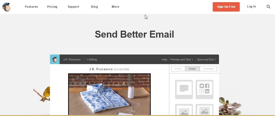
Mail chimp – clear call to action buttons with colour contrast against a visually stunning design. Clear h1 message at the top of the page which summarises Mailchimp in 3 words.
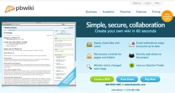
PBWIKI – clear call to actions. Clear value propositions so user knows exact features of the product.
Thinking about increasing your conversions with a website redesign? Before we rush right in there are some things you need to know:
- Website redesigns can be risky – Changing everything in one go can often confuse users, who don’t like change. To minimise this, we perform a full website analysis to find out what is working and what isn’t – delving into the data to produce a design that is specifically tailored to your end users.
- Don’t just make a pretty picture– If you really want to get the best out of your website – we can produce a design based on the very latest in conversion, usability, psychology and know-how. You need insight into the modern psychology of designing for conversion to produce a tangible solution that gets you leads.
There are endless other factors to consider with a webite redesign. The best way to ensure you avoid the pitfalls is to get in contact with us today on 01227 68 68 98 or tell us about your project below.
By Michael Alexander