The quick rise in mobile broadband has caused a huge increase in browsing by mobiles and tablets as well as more traditional laptops and wide screen TVs. Websites now need to work across a huge range of web enabled devices with different screen sizes, resolutions and screen orientation. Responsive design is an effective way of coping with this.
In this article we consider the similarities and differences with accessibility issues around web developments. The internet technology standards developed in a way that made them naturally accessible to all. But in the early 1990’s many web design programs were built that did not. And poorly written websites were created in which it was not possible to separate content from design and not possible to correctly ‘mark up’ the content in terms of the type of content.

Creating an accessible website means ensuring the content can be accessed by all, so this includes sighted and non sighted users, it includes those who cannot use a mouse and those who cannot hear. In many ways the design is not relevant for accessibility. Some aspects such as colour contrast are important, but layout is not a huge issue. This is largely because style sheets can be changed to show the same content in a different way. And this is the important point – one set of content is shown in different ways by style sheets.
Companies that invested early in accessible websites gained hugely in reduced development costs as future design changes were easier.
Responsive Design
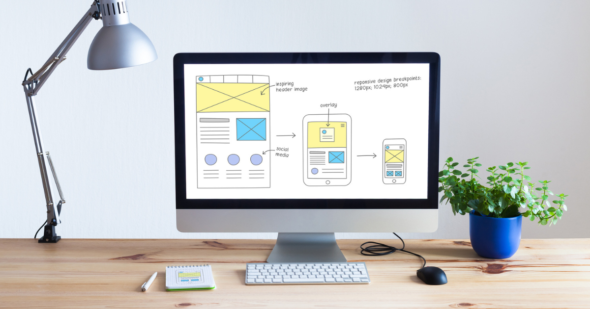
Responsive design allows the user to view the content in a manner (style and layout) that best suits the particular device.
The responsive design concept is enabled by CSS3 technology and in particular a new feature known as media queries that allows capable browsers to detect the size of the user’s screen. This enables the same content to be shown in different ways (layouts) on different devices. Note the similarity with accessibility.
ExtraDigital think that companies that invest early in responsive designed websites will gain hugely in reduced development costs as future design changes will be easier and more robust to changes in devices.
Implementing a responsive design on a website that is already accessible is easier than on one that is not. The biggest challenges are usually with images – ensuring the large images for desktops are not downloaded onto mobile devices.